Industrial Engineering Employment Trends: A Data-Driven Perspective

design
development
analysis
data manipulation
Authors
Published

December 8, 2025

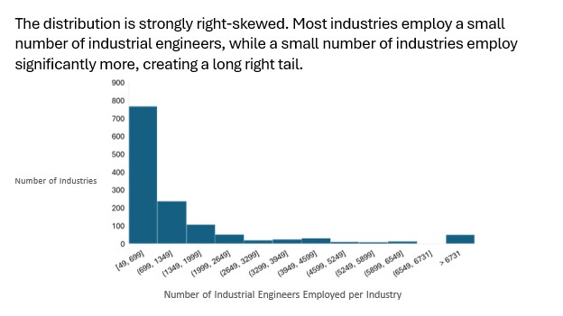
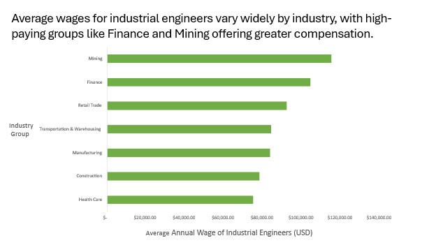
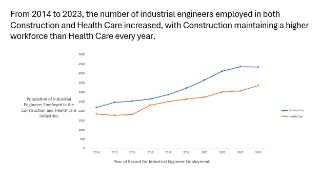
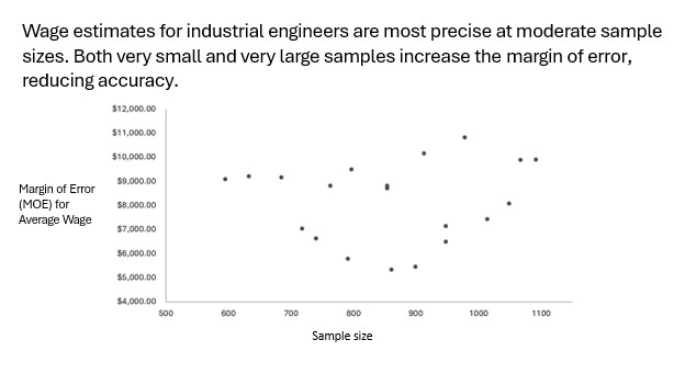
The dataset we selected for this project is called Occupations by Industry and we found it on the Data USA Industrial Engineers website. It provides detailed employment records for all industries where Industrial Engineers have been employed. The data includes information on industry sectors, groups, and subgroups, as well as average wages, workforce size, workforce growth, and wage growth for Industrial Engineers across different industries. Using this data, we created four graphs to visualize key trends in employment, wages, and industry distribution for Industrial Engineers.

What is the distribution of industrial engineers employed across all industries? This question allows our team to see how the employment of IEs is distributed across industries, revealing whether most industries employ only a few IEs or if there are significant clusters of industries with large IE workforces. Such insights are valuable for understanding the reach and concentration of industrial engineering roles in the economy. This question is interesting to use because it helps identify which sectors offer the strongest job opportunities for future IE graduates. To answer this question, our team used Excel to clean the employment column, format it as numerical data, and then insert a histogram to visualize distribution. We adjusted the bin widths, axis scales, and labels, so the chart showed how IE employment varies across multiple industries. After finalizing the chart, we placed it into an assertion-evidence slide using the histogram as the supporting visual and making the main conclusion as the title.

Which industry group has the highest average wage? This visualization makes it easy to compare compensation across industries and highlights where industrial engineers are most highly paid. This perspective is useful for IE’s considering potential career paths and for organizations to compare their pay against other industries. To make this bar chart, we created a pivot table from the data that included the Industry Group and the Average of Average Wage columns. We then filtered the table to show only the top seven industry groups. In the graph, the industries were placed in order from highest to lowest average wage, with the highest on the top.

How has the total population of Construction and Health Care changed over time? Examining how the Construction and Health Care populations have shifted over time reveals important insights into industry growth and the evolving demand for Industrial Engineers. Understanding these trends is valuable both for IEs seeking career opportunities and for companies planning their workforce needs. The steady growth shows IEs are valuable in both areas, while the differences in workforce size reflect how extensively each sector applies IE methods. To create the time-series plot, we used a pivot table built from the original dataset, focusing on the Year, Construction Workforce Population, and Health Care Workforce Population columns. Plotting both trendlines on the same graph allows us to clearly compare how the presence of IE’s has evolved in Construction versus Health Care over time.

How does sample size relate to the accuracy of wage estimates? This question helps our team understand how sample size affects the accuracy of wage estimates. It shows an optimal sample size range for data collection: too few samples are unreliable, and too many can increase uncertainty. This insight is valuable for IE’s to plan efficient data collection, ensuring accurate and reliable results. To make this graph, we used the Average Wage Approximate Margin of Error and the Sample Size columns. After selecting the data, we picked the basic scatterplot Excel chart and added the axis titles.